
National Post Video Centre Redesign
Live Site: https://nationalpost.com/video-centre/
In June 2020, I played a key role in launching a substantial update to the national centre video centre design, incorporating numerous changes, including new features like self-scroll bars and relocations of existing elements, alongside an overhaul of the overall information architecture. These modifications aimed to address the inherent challenge of growing complexity as more content was added from diverse categories on YouTube. Following the launch, within two months, we achieved a notable 30% increase in viewership, as evidenced by backend analytics.
Before and After
2019 National Post Video Centre
Before.
Other than issues such as information overload, our main player alone has taken over almost the full above the fold screen space even before the user can scroll to uncover more videos to watch.
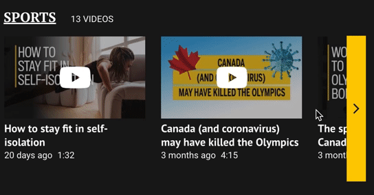
Our many other videos in the various categories can only be exposed to users when they click on the not easy to realize "see more" button.

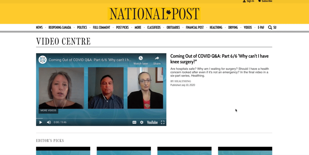
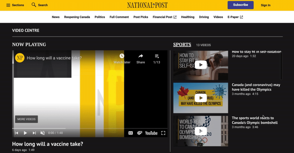
2020 National Post Video Centre
After.
The new updated video centre has a uniformed look with scroll bars to allow the ease of information recovery. The whole platform is also WCAG accessible. I have also redesigned the information architecture of the various playlist to fit the user’s mental model of information discovery by repurposing the original featured video position into a video player.
Making the right things stand out.
The Video Centre faced challenges where even long-time users were unaware of certain content due to its placement in obscure locations. This complexity hindered the effective showcasing of meaningful content. To address these issues, a closely-knit team collaborated with researchers and product managers, creating rough prototypes and seeking feedback from developers on design feasibility. The primary goal of the redesign was to enhance content accessibility and discoverability. The guiding principle focused on helping users easily navigate the extensive video options, leading to the elimination of the original "see more" button and prioritizing an intuitive video listing. The initial low-fi prototyping process was swift and prioritized simplicity, resulting in intriguing prototypes exploring visual presentation and a general overhaul of the information architecture.
Determining Postural of Interaction
I kept in mind that the world news is fluctuating everyday and hence have decided to lean my designs towards a more sovereign posture of interaction. This is mainly due to the fact that the information is always changing on the page and most people will still visit often to check out the latest video news. The main persona Edward was the “Factual news lover” that I have identified to be our main user.
Sovereign
First group of users use the video centre as a relatively sovereign platform - it is almost a day to day video resource for them to look for information, they tend to visit the web everyday and prefer to source latest news through videos.
Hence - These group of people are mostly intermediate - expert users of the site. They are relatively familiar with how the interface works.
Transient
The second group of users only use the video centre from time to time, they sometimes bookmark the page and visits when they are interested in searching for some videos on a particularly interesting topic.
These group of people consists of a range of junior - intermediate users. Some of them tend to have some trouble finding information on the page.

Designing Interactive Patterns

V1 - Designed for 3 different levels of experience (beginner, intermediates and experts usage of the centre)
This version focuses more on presentation of categories without much scrolling. Allowing both old and novice users to find categories quickly. The horizontal layout also helps the expert users to see all that the page has to offer without much scrolling.

V2 - Inspired by the organizer-workspace way of structuring a page - this 2nd version focuses more on horizontal scroll with one featured video which changes based on what you click on from the bottom categories. Since this design pattern is optimal for full screen applications that require user access to different types of objects and groups.

V3 - This version is another adaptation of the 2nd exploration - which focuses more on vertical scroll of videos with a display video player at the top. Based on the framework - the organizer being the list/overview and player being the detail.
Tested these designs and here’s what we found out…
Most people prefer clearer indications of more videos and what they can expect from the video list (eg amount of videos).
Many readers do not have issues viewing/finding these videos but they have difficulties adjusting when the videos bring them out of national post and directly to Youtube.
The autoplay on mobile is a potential concern when the viewer is on the phone as it may potentially cause extra data charges.
With these in mind I set up to make mid to hi-fi prototypes, first I played around with how to display more videos (from shadowing to scroll buttons). And as a team we ended up deciding on a horizontal full length scroll function and an auto scroll button. Another notable pivot was that we ended up forgoing the shadow approach as it is not accessible and might potentially cause some difficulties for our users with vision impairment.
Also based on the 2nd point of users being afraid of being brought out of the page - we now have direct positive feedback on usage of a primary video within the page itself.
The final decision was hence to explore V2 in further detail as it’s single player was understood to be the least confusing compared to the other 2 versions. Another reason was a development constrain of not being able to deploy too many video players all at once.
Buttons VS Scroll or Both?
Now that I have decided on the presentation, as I moved onto mid-hi fi, the presentation of more video within the horizontal list became another interesting issue to explore. Below were some variations explored within the horizontal bars. Although both version provides manual mouse scroll, version one has auto scroll buttons that helps you to move across the full list quickly.
Hoping to provide the most amount of freedom to our users my team and I ended up deciding on a horizontal full length scroll function and an auto scroll button (Ver 1 V2). We abandoned the shadow approach as it is not accessible and might potentially cause some difficulties for our users with vision impairment.
Ver 1: Manual scroll with autoscrolling buttons

Button V1 (Good exploration but the button is too small on a smaller screen)
Button V2 (Chosen for accessibility and responsive design across all platforms)
Ver 2s: Manual scroll only


Both cropping and use of shadows were also explored as ways of showing more videos.
-
Desktop
-
Mobile

-
Tablet

Final Reflections
I am glad that I have talked to many stakeholders and showed them my designs in a very low fidelity from very early on. Their feedback in the early part of the process is very helpful and saved me from designing something that was not feasible. This shows that constant communication is very important in the design process.